
Human Mobility in Response to COVID-19 in the San Francisco Bay Area
The following is a case study utilizing public data sourced by the California Health & Human Services and Descartes Labs (CC By 4.0 License). This is a data exploration into how well SF Bay Area residents adhered to shelter-in-place orders and how it relates to COVID-19 cases in the region.
About the Data
The information collected by the CHHS and Descartes Labs is de-identified, aggregated, and summarized to protect the privacy of users and communities. (CHHS Data Playbook)
Interpretation of M50 Index: Developed by Descartes Labs, the Mobility Index shows the change in movement referencing a 100 value based on median distance traveled in each county the week of February 17, 2020. For example, a mobility index of 50 means the median distance traveled is half of what it was during the week of February 17, 2020. The following visualizations will refer to an M50 Index value of 100 as the “Pre-COVID-19 Baseline.” Descartes Labs collects anonymous data from a sample of mobile devices reporting their location throughout the day, then calculates the maximum distance moved from the first reported location. More information can be found on their website.
Prepare/Process Data
Given the large sizes of the datasets, I used R via RStudio to prepare, process, and analyze, with visualizations created using Tableau
Utilized SUBSET and BIND_ROWS functions to filter for and create new dataframes of only the 9 different SF Bay Area counties
Utilized pipes, GROUP_BY, SUMMARISE, and JOIN functions to further clean SF Bay Area datasets and combine mobility and COVID-19 cases variables by date into a new dataframe
Analyze
First, let’s take a look at how COVID-19 has progressed in the SF Bay Area from the beginning of the pandemic until the end of May 2021.
Important dates referenced:
March 16, 2020: 6 SF Bay Area counties impose shelter-in-place orders
March 19, 2020: CA state imposes shelter-in-place order
December 14, 2020: CA vaccinations underway
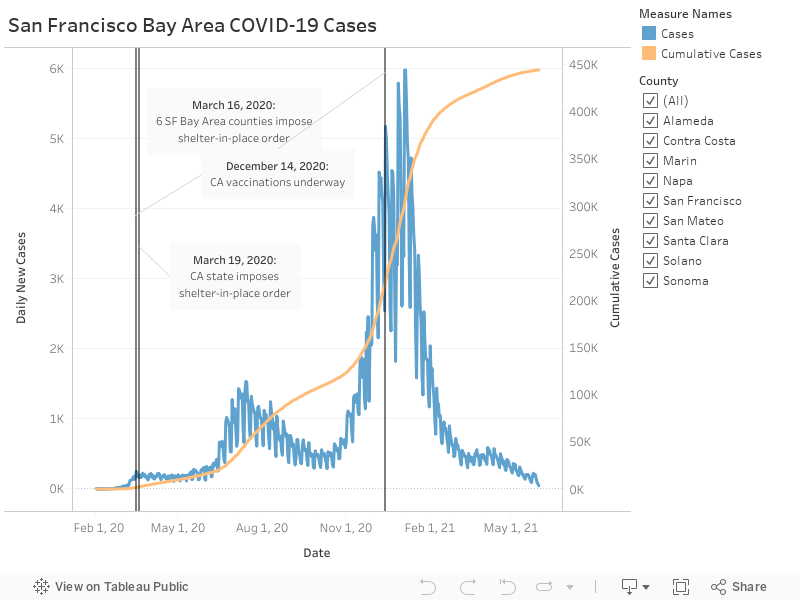
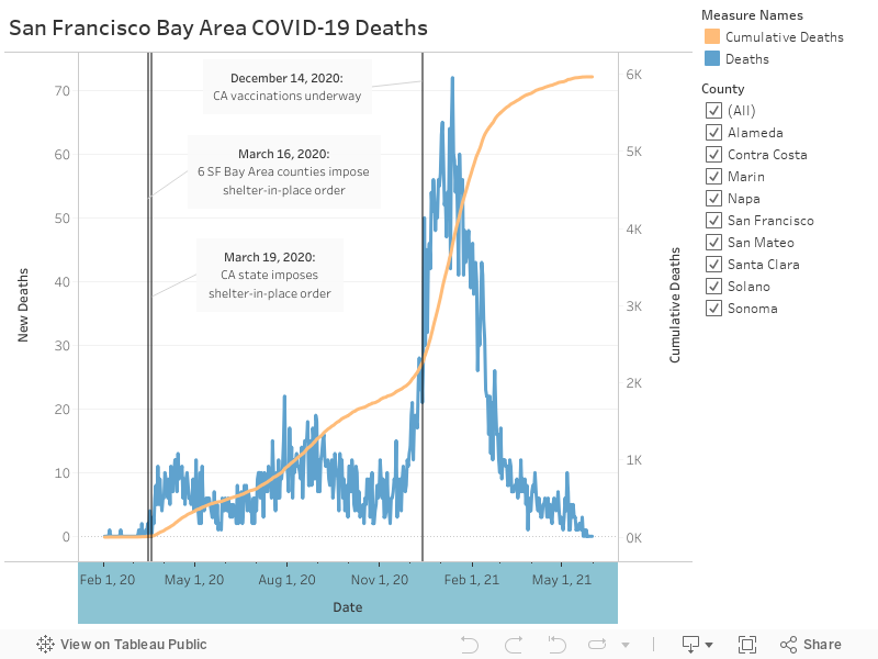
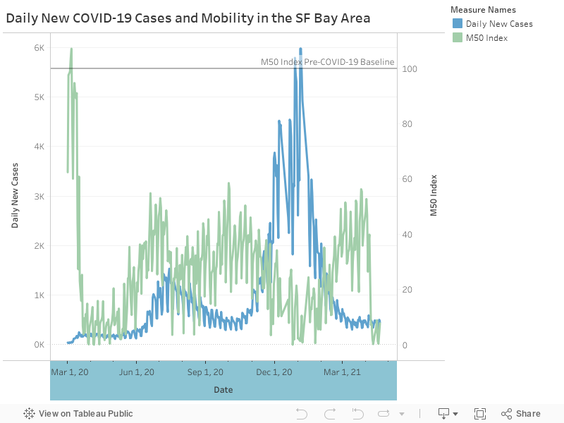
We can see that daily new cases and daily new deaths peaked in the summer months (June, July, August) and the holiday season (November, December, January).
Next, we’ll take a look at median distance travelled by residents in each county and the average of those for the Bay Area as a whole.
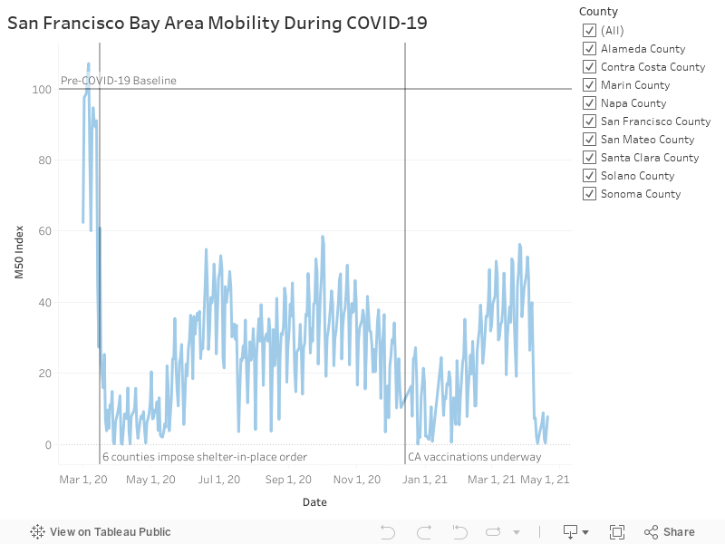
As news surrounding COVID-19 became increasingly serious, even in the days leading up to March 16, 2020, the day 6 counties imposed shelter-in-place orders, we observe that mobility drops off and remains under the pre-COVID-19 baseline going forward. Folks began traveling shorter distances from their homes, but to see what impact, if any, this had on COVID-19 cases in the region, we’ll directly compare mobility and daily new cases.
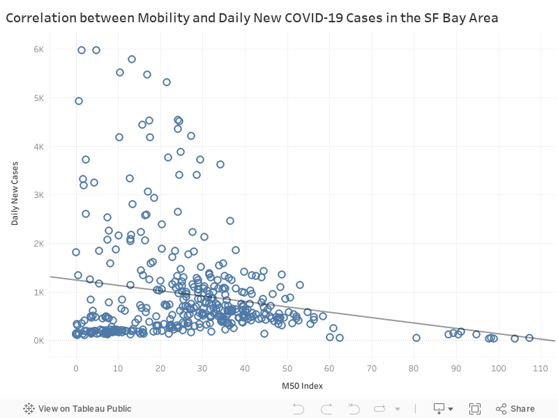
By this scatterplot, we observe that as we move closer to pre-COVID-19 mobility levels (M50 Index = 100), the number of daily new cases in the general Bay Area decreases. With a p-value of 0.00017, this negative correlation is statistically significant. However, a caveat of drawing this conclusion based off of p-value alone is that this direct comparison doesn’t account for dates, among other factors. Accounting for dates in the following visualization, we find that while human mobility primarily remains below the “normal” threshold, cases are still peaking over the summer and especially so over the holiday season when mobility is at one of it’s lowest.levels. While residents generally adhered to shelter-in-place orders, even beyond the dates those mandates were lifted, mobility via cellular data has its limitations.
Other factors to take into consideration:
Early in the pandemic, the situation was still evolving and widespread diagnostic testing was not available. Tests were only permitted for individuals symptomatic with a multitude of symptoms. The United States Centers for Disease Control and Prevention (CDC) went back and forth with these guidelines until September 18, 2020, when they revised the testing protocol to include testing for asymptomatic individuals with known exposure to confirmed COVID-19 individuals.
Cases are underreported, given early pandemic testing only included symptomatic individuals, but asymptomatic spread is a large driver.
Folks may be traveling shorter distances from their homes, but may still be interacting with others outside of their immediate social bubble (e.g. co-mingling social bubbles).
Key Findings
Daily new cases and daily new deaths peaked during the summer months (June, July, August) and holiday season (November, December, January), also evidenced by the increased slope in those periods on cumulative cases.
Human mobility dropped below the pre-COVID-19 baseline in the days leading up to shelter-in-place orders in 6 SF Bay Area counties, and stays below that threshold thereafter.
This drop in mobility is inconclusive in impact as it relates to COVID-19 case and death trends in the region.
Other Considerations for Future Exploration
Collect additional cellular data to count and measure proximity to other phones/individuals to analyze social distancing and social bubbles.
Collect data on contact tracing efforts to mitigate spread and analyze relation to mobility and COVID-19 case and death trends in the region.
Conduct a sentiment analysis using data from Twitter in response to each time the CDC revised COVID-19 diagnostic testing guidelines.
Data Sources: